
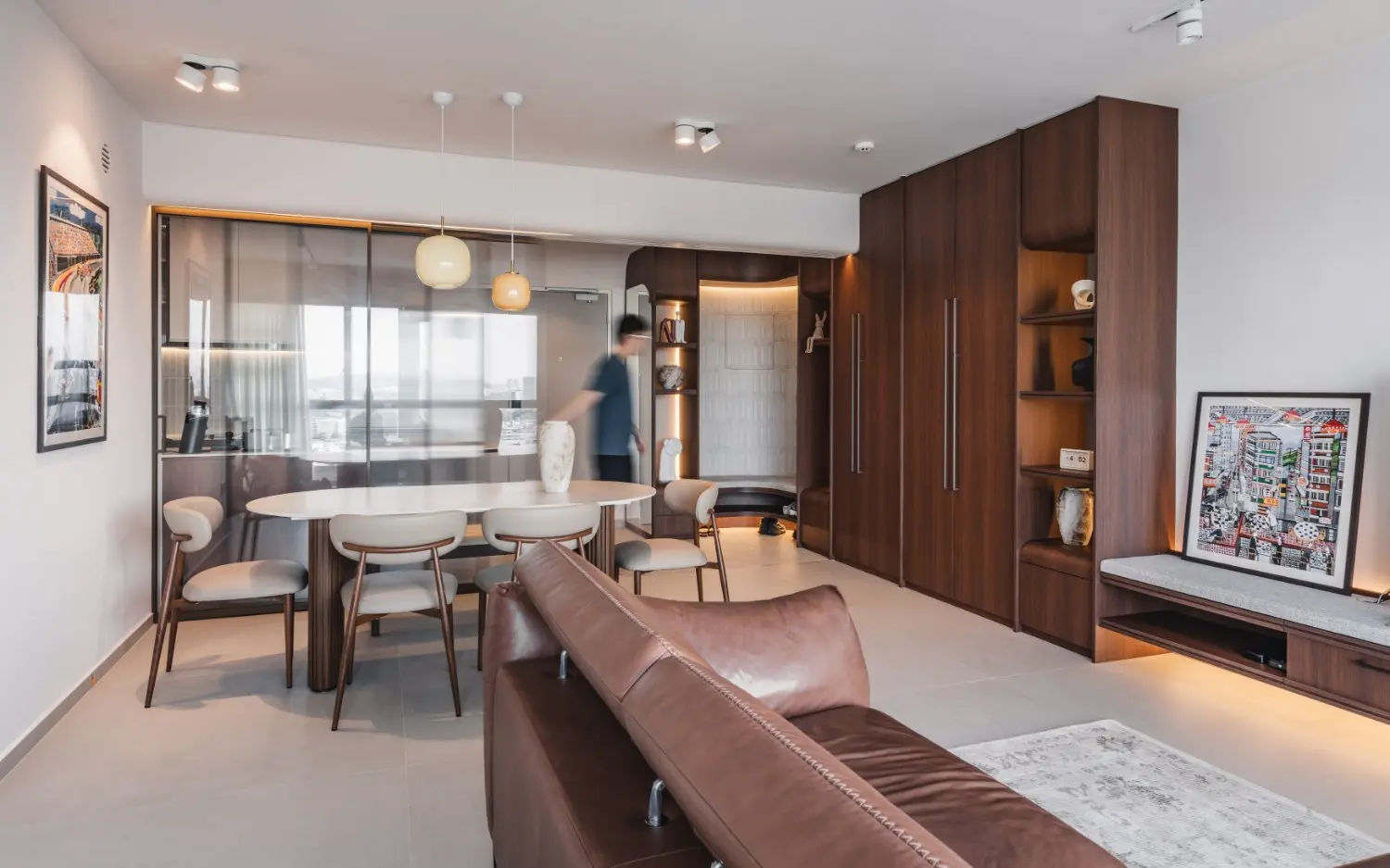
Before mono.poly considered a colour or finish, the studio looked at what the apartment already possessed: an unblocked north-facing view, full-height living-room windows and the potential for a brighter, more connected plan.
Rounded corners recur across Rondure, but the project is not an exercise in applying curves everywhere. Its character comes from control. Warm timber, tactile fabric-look surfaces and carefully placed arcs create softness without turning the interior into a theme.
The palette grew from the clients' affinity for dark wood and mid-century modern interiors. Rich timber laminates establish depth, while fabric-look finishes across cushions, wallpaper and selected cabinetry soften their visual weight. Large-format floor tiles maintain continuity from room to room; patterned subway tiles, fluted glass, feature lighting and carefully chosen hardware add texture at a more intimate scale.
A Threshold That Introduces the Whole Home
The entrance patio is a compact manifesto for the project. A concealed distribution board, built-in settee, the edge of the kitchen peninsula and pebble-wash flooring are composed into a practical moment of arrival. Rounded joinery draws the eye forward, while illuminated shelving gives everyday objects a deliberate place.
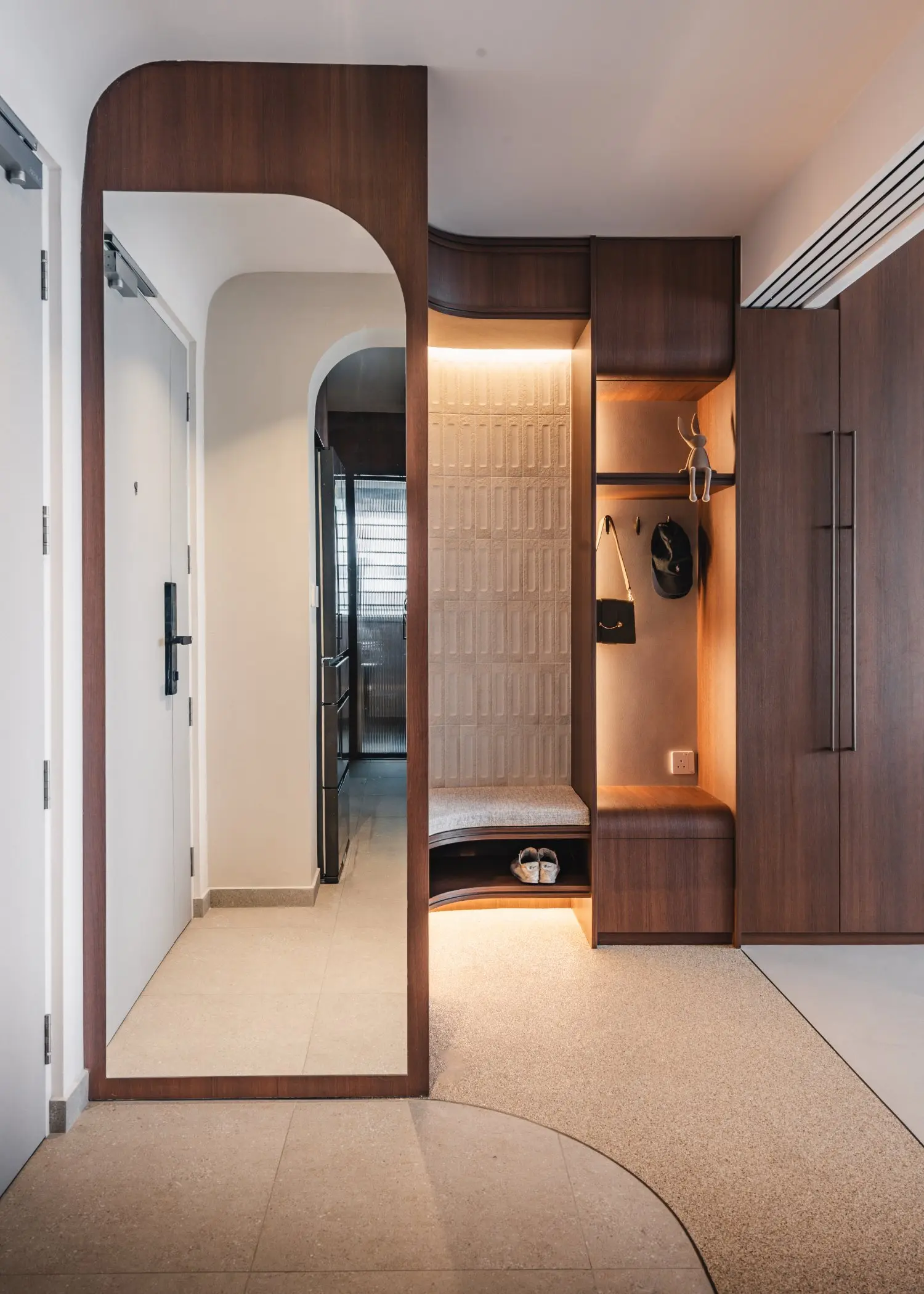
The entrance condenses the home's material language into one carefully resolved threshold: warm timber, textured surfaces, storage and light.
The View Sets the Plan
In the main room, cabinetry is pushed to the perimeter so the panorama remains the most important presence. A low television console and open display niches sit within a wall of dark timber, while the leather sofa and rounded dining table establish a warmer, more domestic scale against the broad window line.
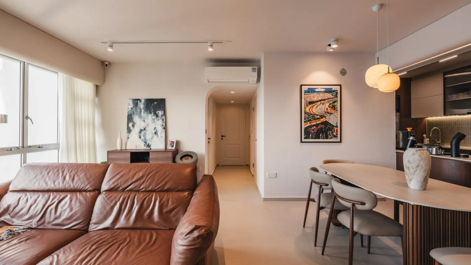
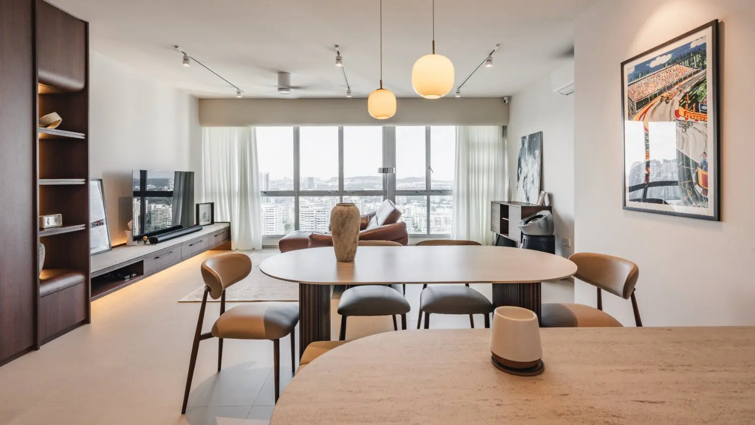
From the living room, the view extends past the leather sofa towards the dining area and private hallway. The reverse view from the dining table opens towards the television wall and full-height windows.
The dining table sits between living room and kitchen, making it both a social centre and a hinge in the circulation. Pendant lights mark the zone without lowering the visual ceiling, and a curved end to the peninsula keeps movement fluid around a frequently used corner.
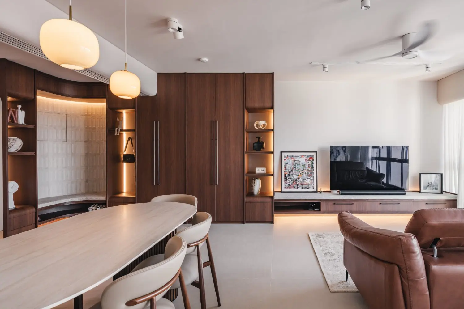
Seen from the dining side, the elongated table leads towards the timber feature wall while generous clearances preserve an easy route through the shared space.
Open to the Morning, Enclosed for the Work
The kitchen carried the project's central planning challenge. The clients wanted to take in the view over morning coffee, yet needed complete enclosure for heavy cooking. mono.poly removed the original boundary and introduced a broad glass sliding door running from the peninsula towards the entrance niche. Open, the kitchen joins the social space; closed, it becomes a contained working room without losing light or sightlines.
The solution emerged through discussion and mock-ups. Although the clients were initially open to removing the kitchen walls altogether, mono.poly felt that an entirely open plan would sacrifice useful separation. The large glass sliding partition became the negotiated middle ground: visually generous in everyday use, yet capable of restoring a clear boundary when cooking demands it.
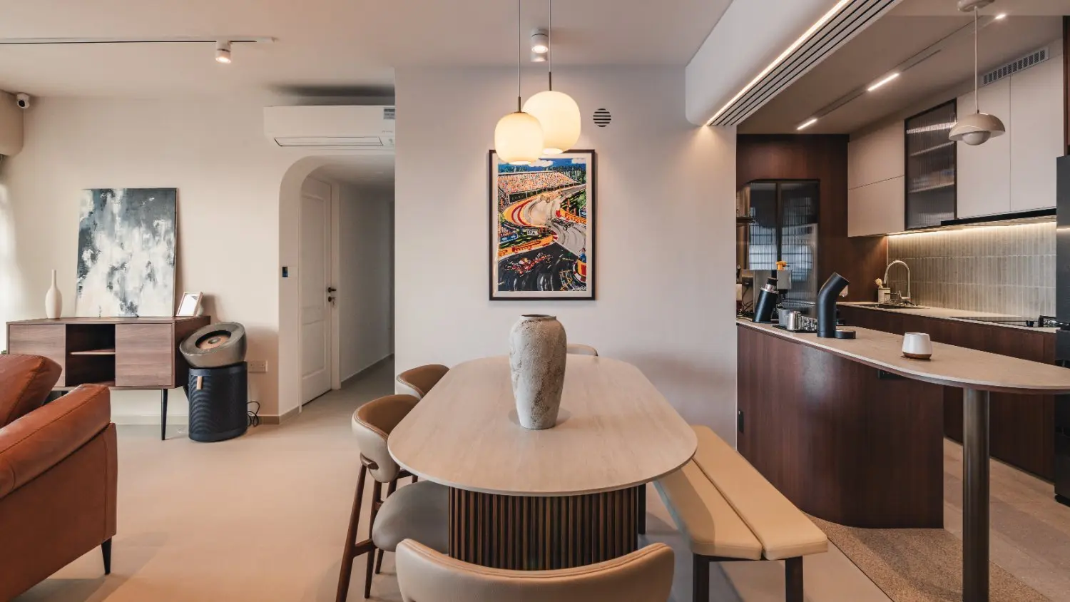
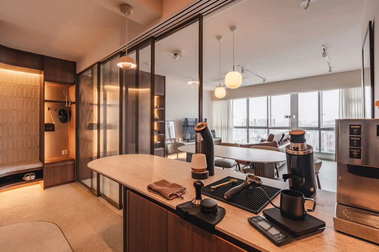
The curved peninsula doubles as a coffee corner. In the second view, the glass sliding panels are drawn across the kitchen, demonstrating how heavy cooking can be enclosed without sacrificing the view.
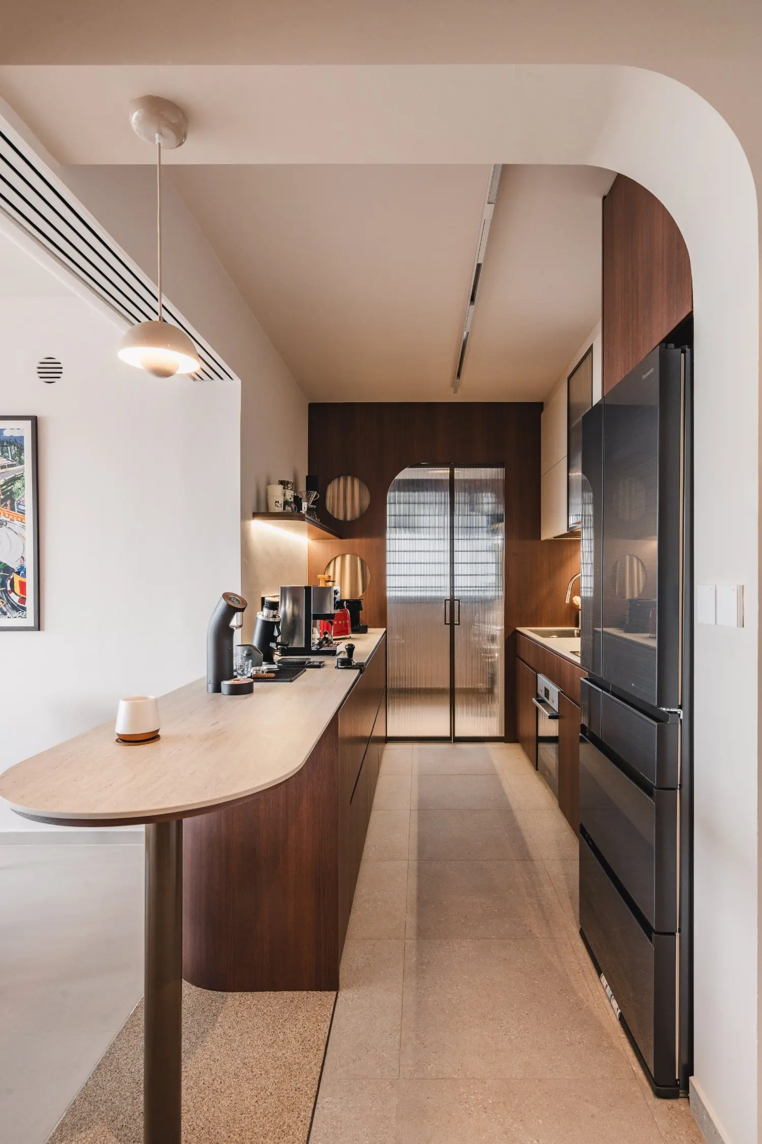
Rich timber, a curved peninsula and warm task lighting give the practical galley kitchen the same layered character as the living spaces.
A Private Suite That Works Through the Day
The master bedroom was combined with the adjoining room, reclaiming corridor space to form a self-sufficient suite for homeowners who work from home frequently. The office is compact but complete, with full-height storage, open shelves and a desk positioned beside the window.
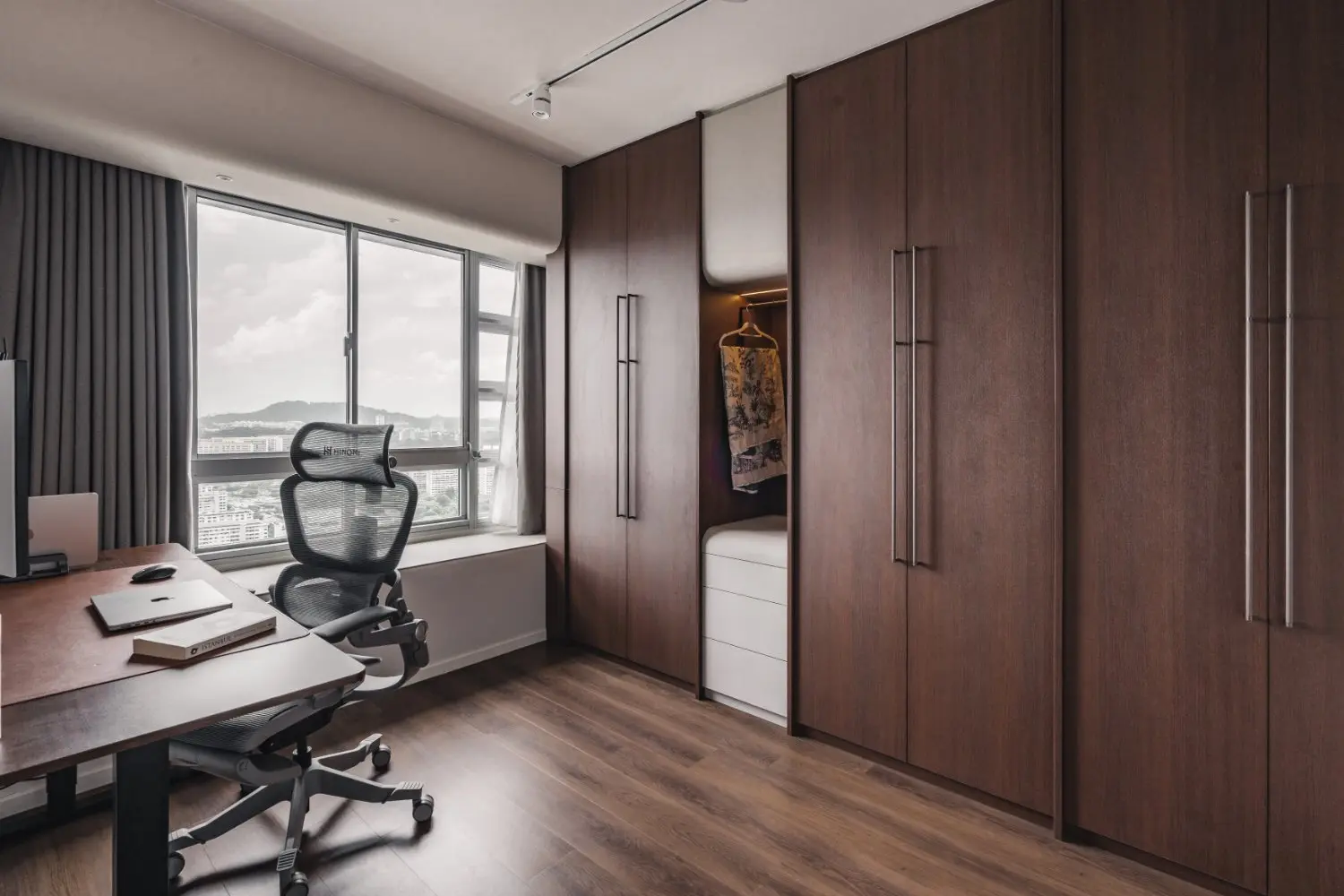
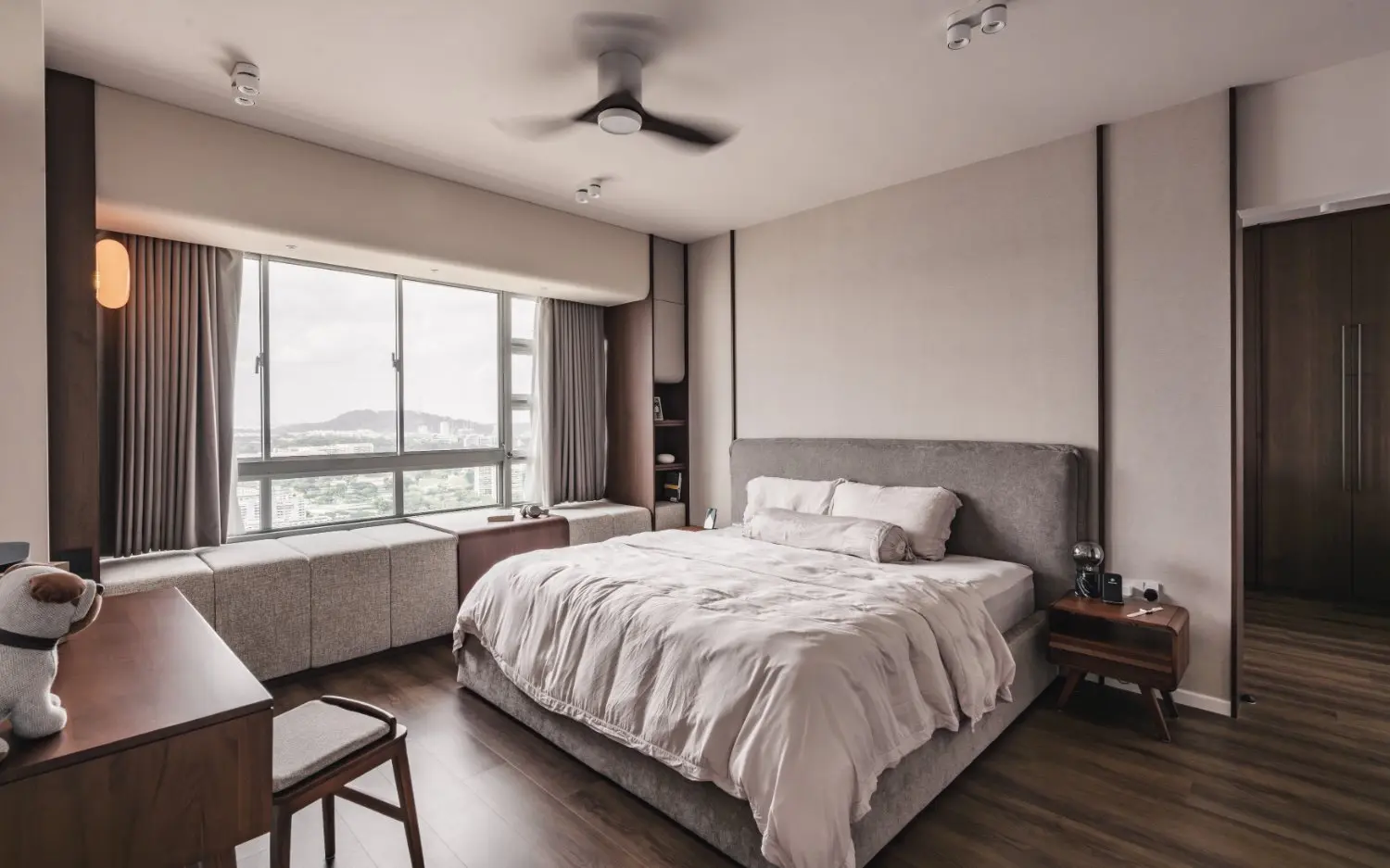
Work and rest occupy distinct zones within the enlarged private suite, joined by a consistent palette of dark timber and soft grey.
In the bedroom, the bay window becomes a lounging nook rather than leftover ledge space. It is a place for reading, resting and family time, with the city view held as a constant backdrop.
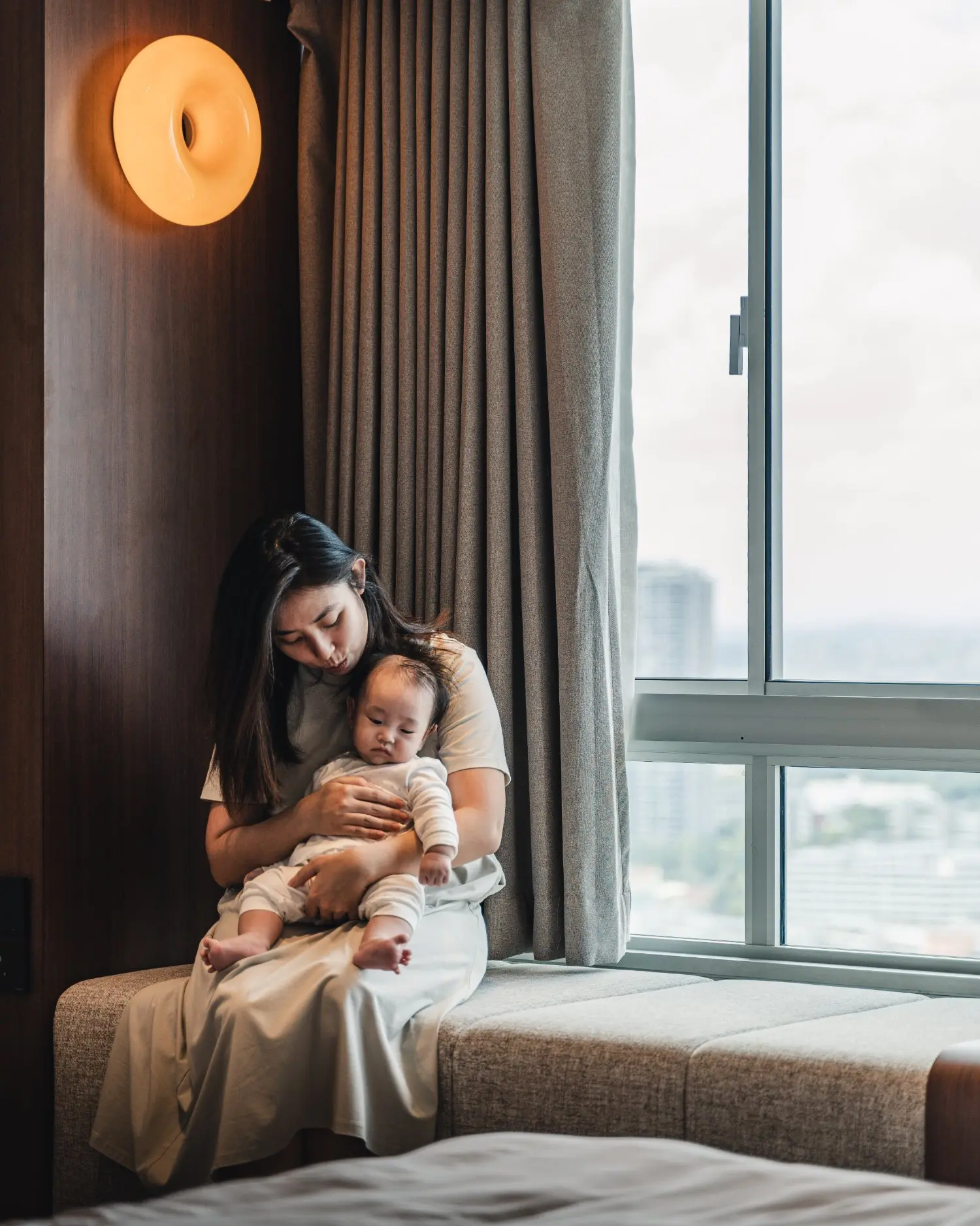
The bay-window ledge is turned into an intimate family retreat, demonstrating how a small planning move can change the rhythm of daily life.
Texture in Place of Ornament
Curves return in the bathroom through the mirror and wall geometry, balanced by vertically textured tiles, a timber vanity and warm concealed lighting. The shower is darker and more enveloping, with a recessed shelf integrated into the tiled wall.
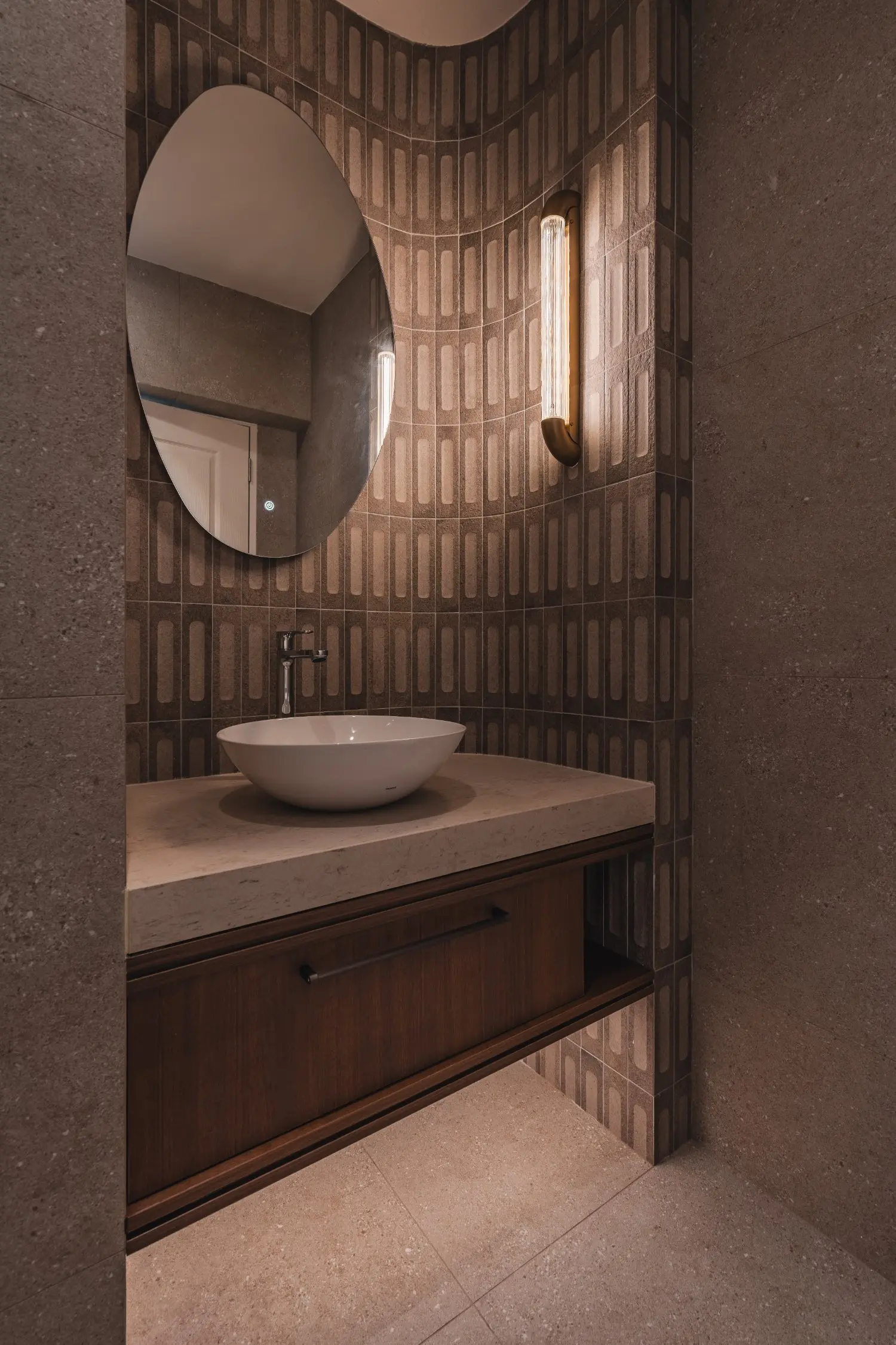
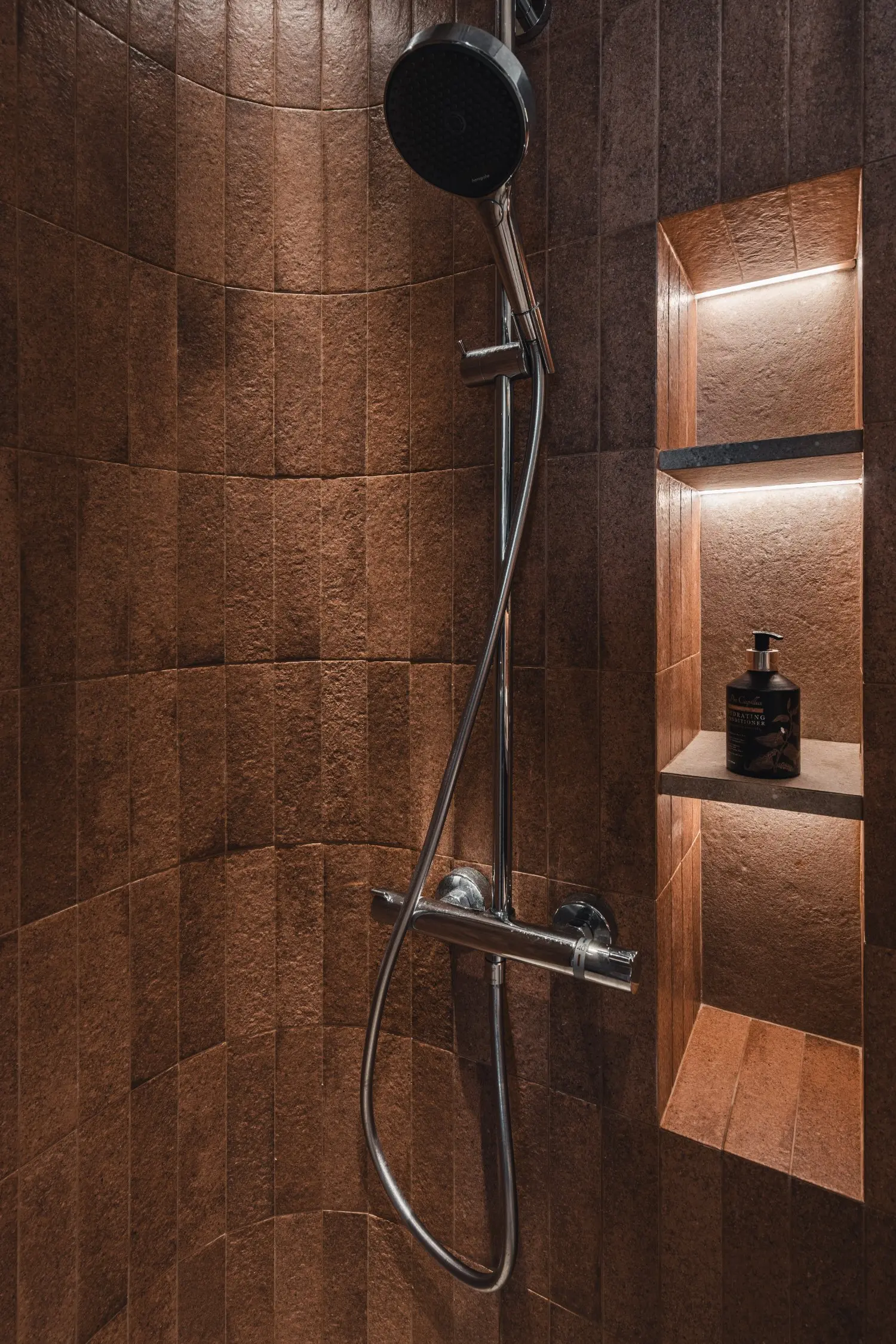
The vanity uses light and relief to create depth; the shower shifts into a darker, quieter material register.
Character Through Control
Rondure's sustainability is deliberately quiet. Low-formaldehyde plywood was specified for all built-in cabinetry, prioritising indoor air quality for homeowners preparing to welcome a child. In the service yard, the plan was also reworked to create a compact, daylit helper's room with a foldable bed, giving privacy without wasting space.
The project ultimately argues that thoughtful planning has more influence on daily life than any single finish. The large decisions—opening the view, separating the kitchen with glass and enlarging the private suite—are supported by small ones: where a hook sits, how a corner turns and whether movement through the home remains clear.
That clarity was tested against the patterns of family life rather than an abstract plan: how a parent moves through the apartment with a stroller, where toys naturally collect, and how the helper's working spaces meet the household's daily rhythm. Rondure's calm is therefore not merely visual. It comes from transitions that have been considered before they become inconveniences.
Rondure finds warmth not through excess, but through knowing exactly where to soften an edge—and where to stop.