
The hardest design brief to answer is often the simplest one. Bright and clean, but not flat. Warm, but not busy. A home for five people — two parents and three children — that gives each of them somewhere to be, while still feeling like one coherent place.
This is the Bishan five-room HDB that J Concept Designers set out to build. The homeowners knew the feeling they were after. What they trusted J Concept to work out was how, exactly, to get there within the particular constraints of an HDB flat: the structural beams that cannot move, the regulations that govern how wiring can be run, the lift that determines what can and cannot be transported to an upper floor. The design had to be both beautiful and practical. It had to hold a family’s daily life without showing the strain of it.
The answer arrived in the form of a single, enduring decision: a continuous natural wood veneer feature wall that runs from the kitchen glass door all the way through to the master bedroom, absorbing four doors into its grain without a single one of them announcing itself as a door.
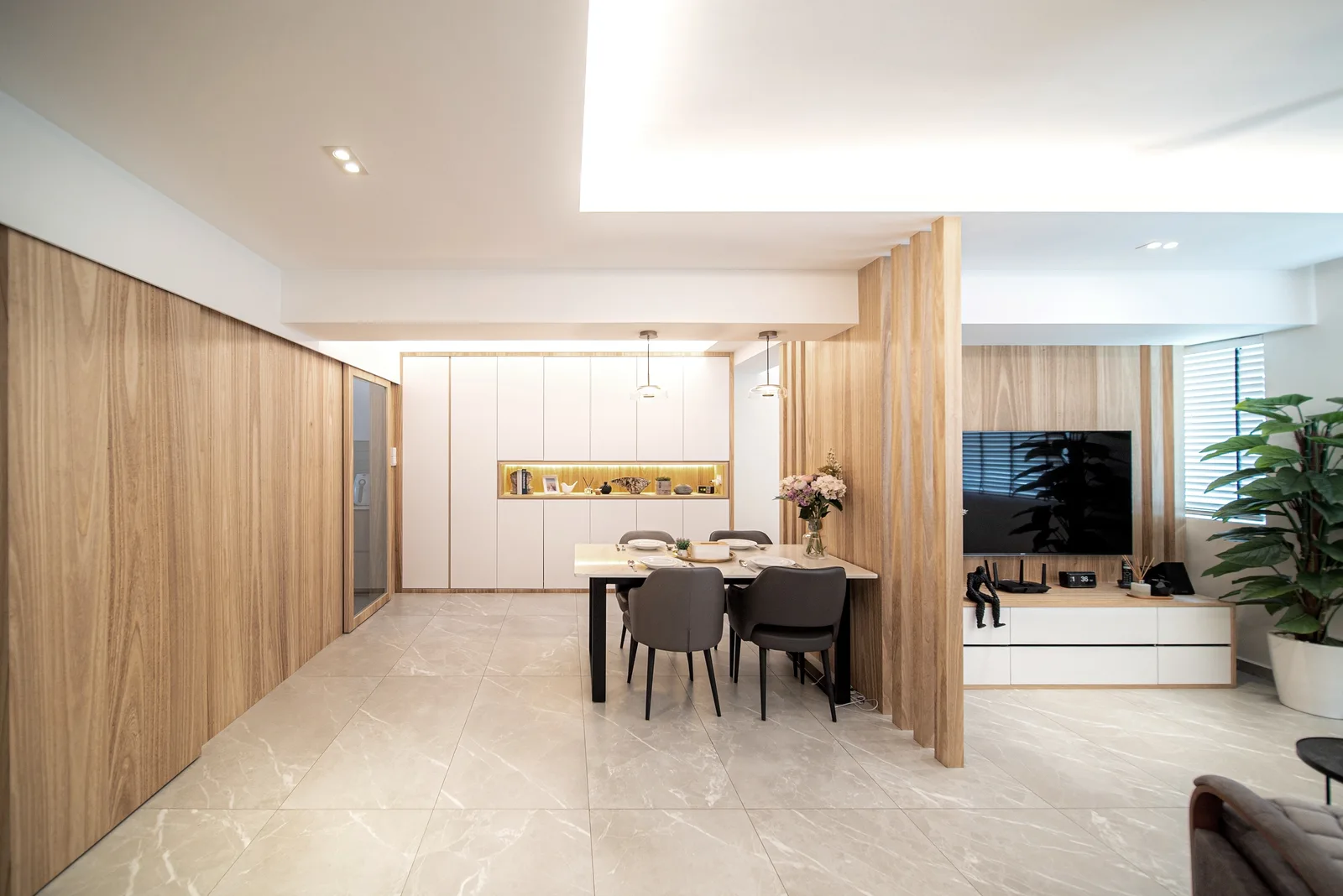
The open-plan living, dining and kitchen zone — natural wood veneer TV wall, timber screen partition, backlit display niche, and marble-veined oversized floor tiles running seamlessly throughout.
Before you arrive in the living room, the entrance already has something to say. A suspended cabinet in white laminate floats above the floor, edged in rich wood veneer, acting as a partition between the entry foyer and the TV area beyond. By suspending it, J Concept Designers made a deliberate choice: the floor continues visually underneath, the space reads as larger than it is, and the division between entering and arriving feels like a breath rather than a barrier.
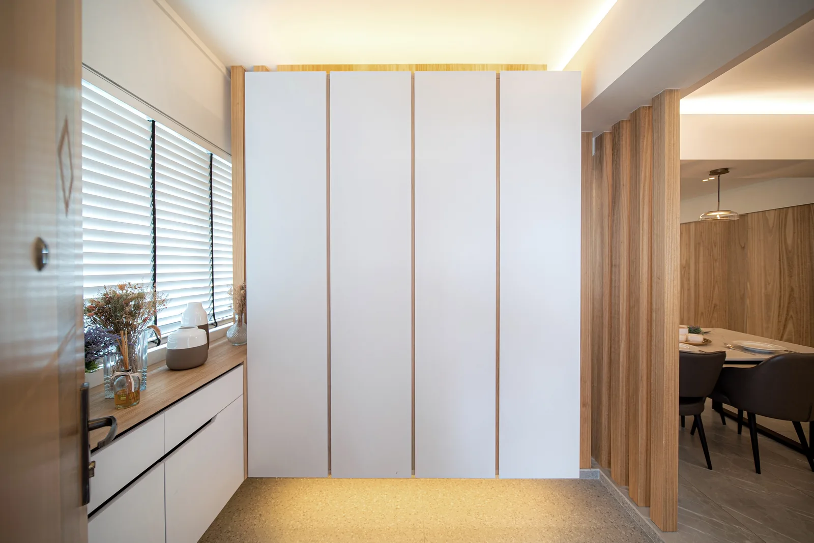
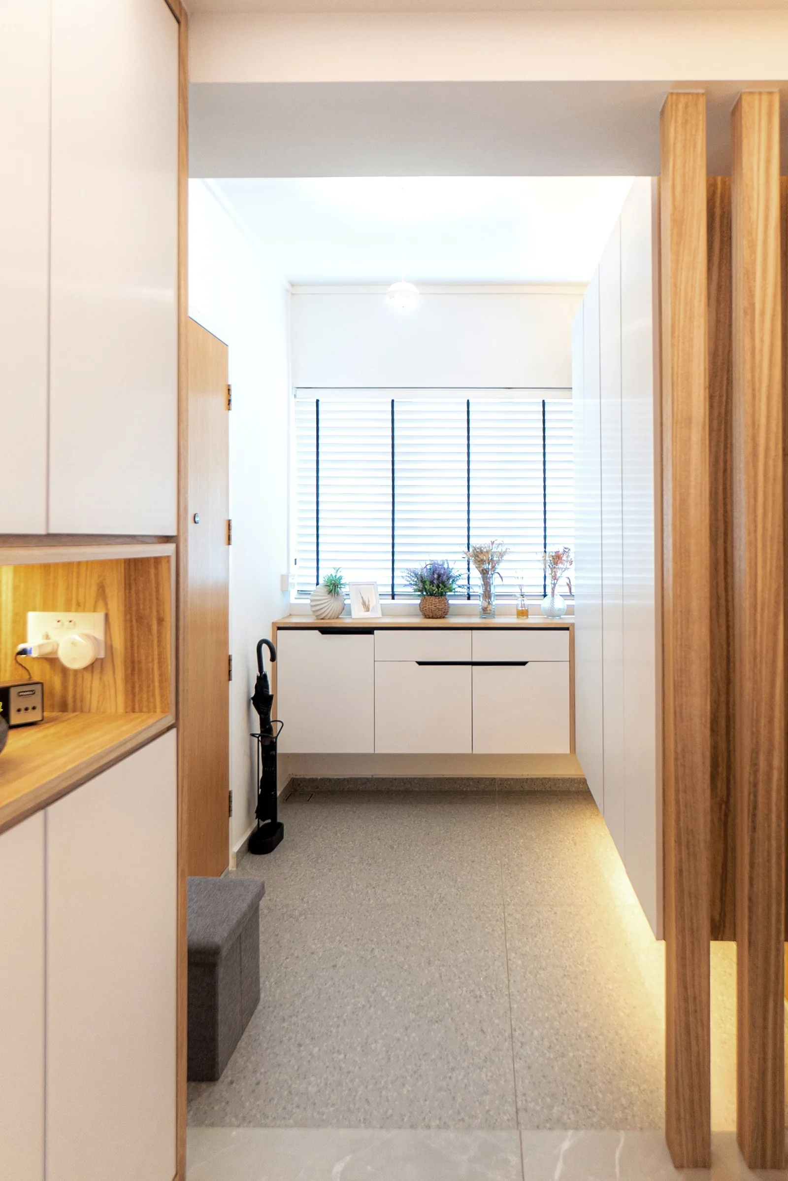
Left: The floating entrance cabinet — suspended above the floor to keep the space visually open, framed in rich wood veneer, with the timber screen revealing the dining room beyond. Right: The foyer looking in — warm integrated lighting beneath the partition, and the shoe cabinet with a timber countertop at the window.
To the side, a timber slat screen softens the visual separation further. It allows partial sightlines into the living room — enough to see if someone has entered, enough to feel connected — while still giving the arrival zone its own sense of enclosure. Light passes through the slats and casts shadows across the oversized floor tiles that shift across the day, turning a transitional passage into something that rewards being walked through slowly.
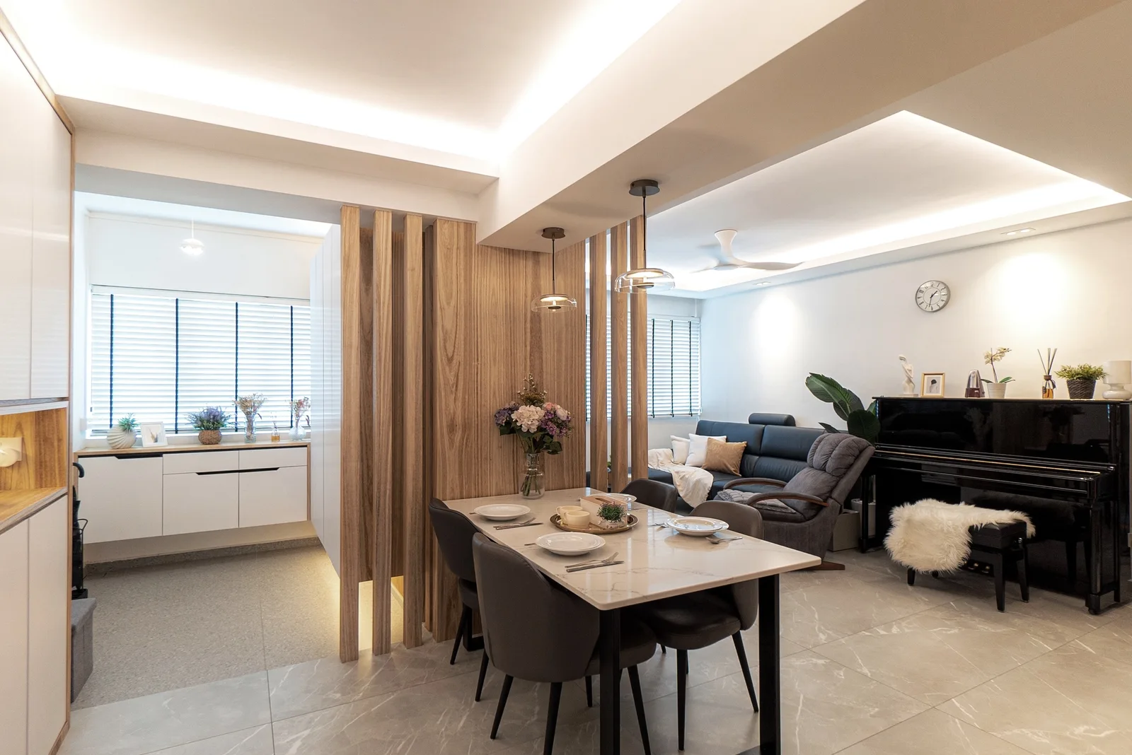
The full sweep from entrance through to the living room — a grand piano anchors the far end, the timber slat screen divides, and the marble-veined tiles unify the entire plane underfoot.
The living and dining zone is organized around two parallel ideas: the warmth of the veneer and the calm of the white. The TV wall in natural wood veneer anchors the living end of the room, its grain running full-height and edge to edge, providing a visual weight that the rest of the room deliberately withholds. Against it, the white cabinetry of the dining wall provides the contrast — clean, handleless, flush-panelled in the manner that J Concept Designers consistently reaches for when the goal is a space that reads as complete rather than accumulated.
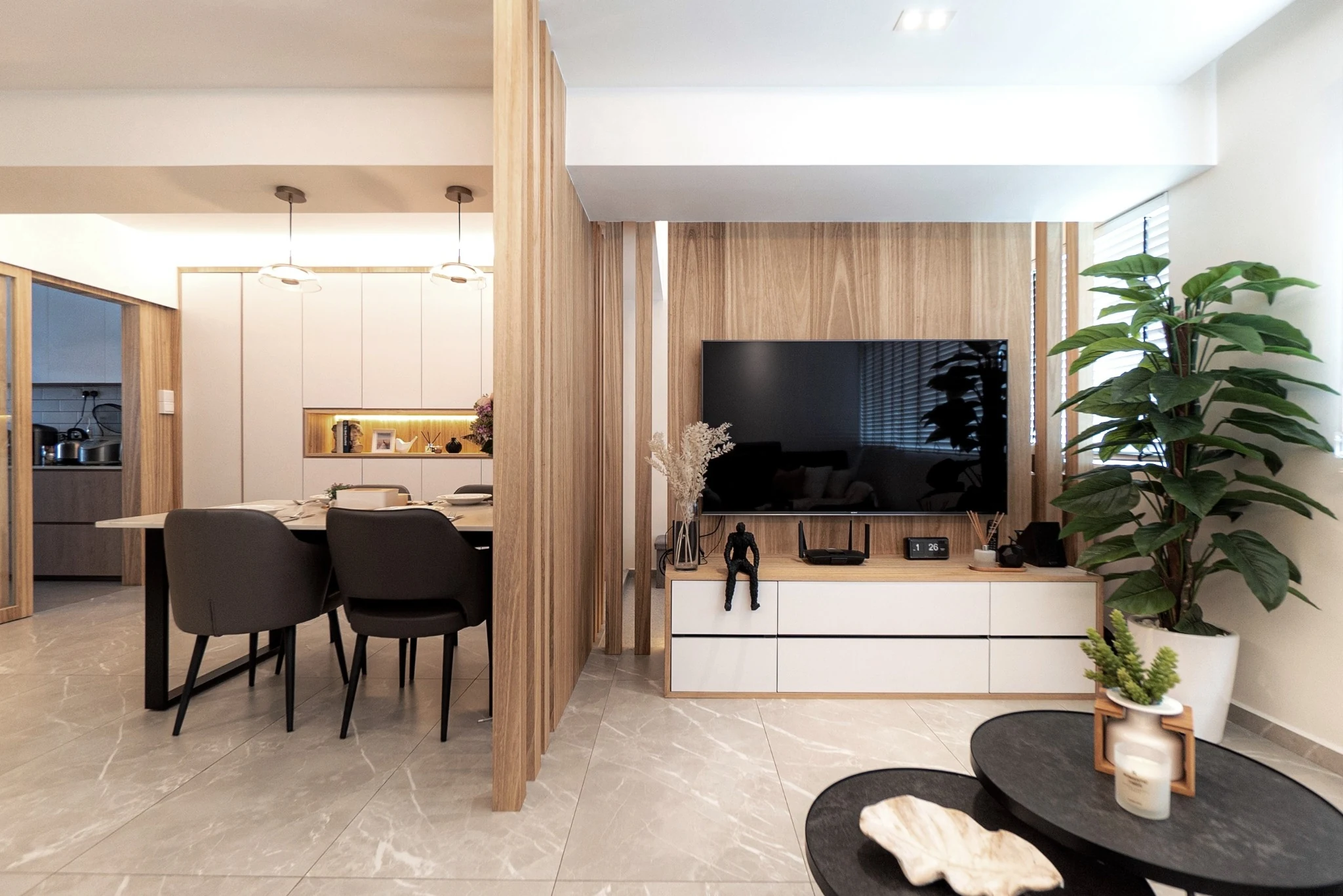
The living area’s natural wood veneer TV wall is paired with low white cabinetry, while vertical timber slats create a light visual division between the living and dining zones.
Positioned at the far wall of the living room, the family’s grand piano provides a dark, architectural counterpoint to the room’s lighter palette. The pair of glass pendant lights that descend above the dining table were chosen in awareness of the structural beam overhead, positioned precisely beneath it so the beam becomes part of the composition rather than a problem to be solved.
Instead of seeing multiple doors, you experience one continuous architectural feature. The veneer wall doesn’t just look good — it erases the visual noise of a busy family home entirely.
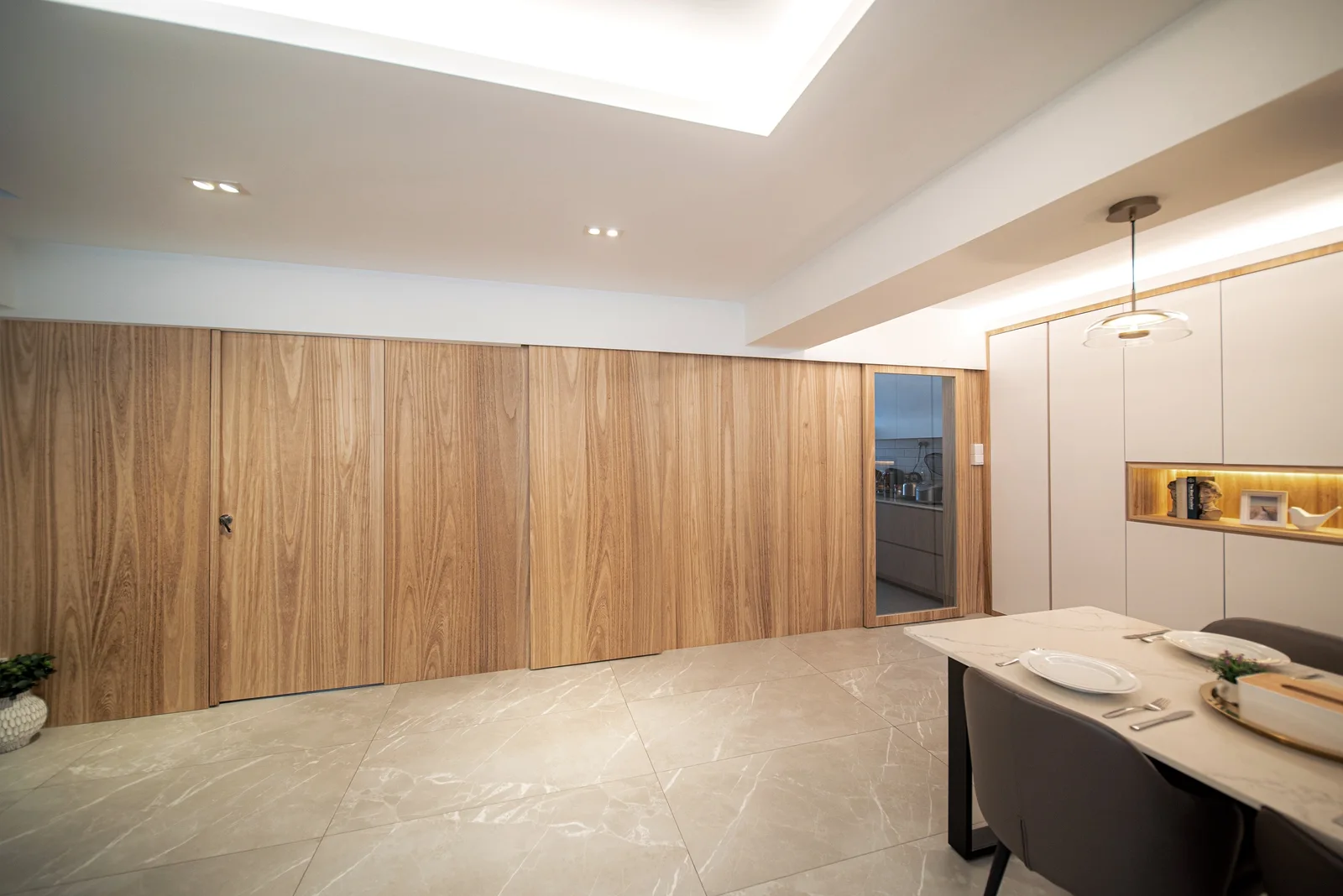
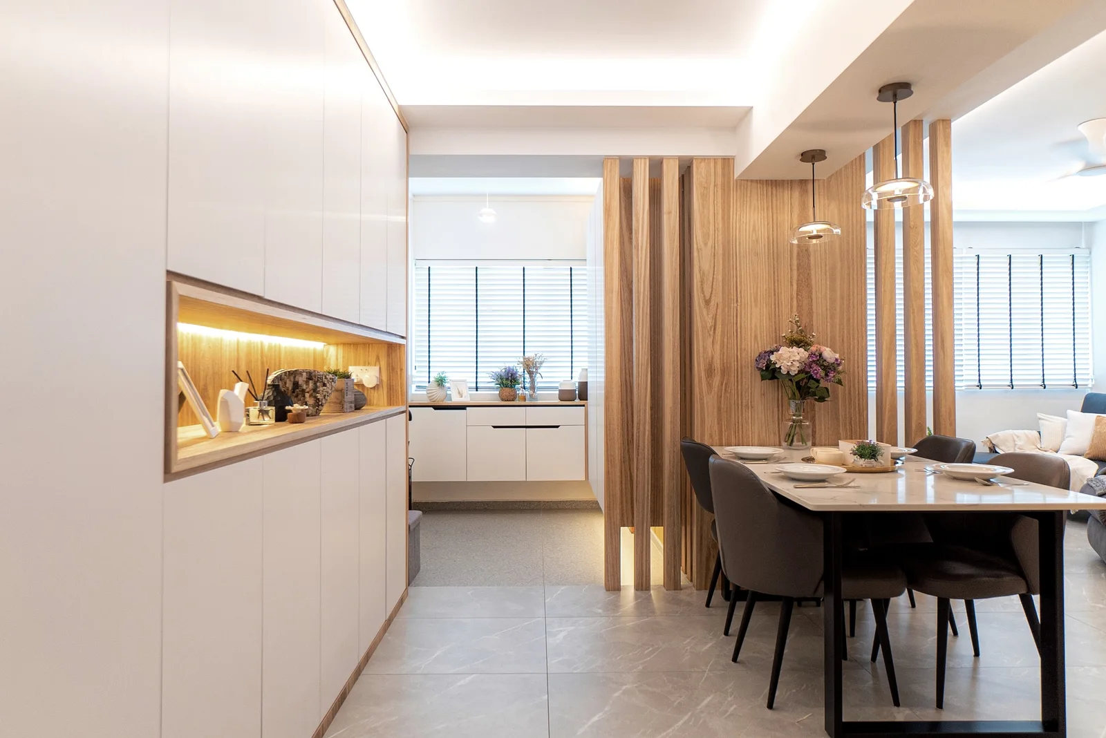
Left: The continuous natural wood veneer feature wall — running the full length of the corridor, with the kitchen glass door, storeroom sliding door, son’s bedroom door, and master bedroom door all absorbed into its surface. Right: The dining room from the cabinetry end — backlit display niche, glass pendants beneath the structural beam, timber screen partition, and the entrance foyer beyond.
The feature wall is the project’s most quietly radical idea. Running from the kitchen glass door the full length of the corridor to the master bedroom, it is a single, uninterrupted surface of natural wood veneer. Within it, the kitchen door, the storeroom sliding door, the son’s bedroom door, and the master bedroom door are all integrated — flush with the panelling, their profiles visually absorbed into the same continuous grain. Walking past the wall, you register only the beauty of the timber. The doors are there, but they are not there.
This is the kind of decision that requires confidence and careful execution in equal measure. The wiring constraints of HDB regulations meant that every light switch and power point had to be routed within the cabinetry rather than the walls — a significant planning challenge that J Concept resolved by carefully integrating lighting and power points within the cabinetry. What the homeowner experiences is a home that appears to have no infrastructure at all, only rooms that begin and end cleanly where they are supposed to.
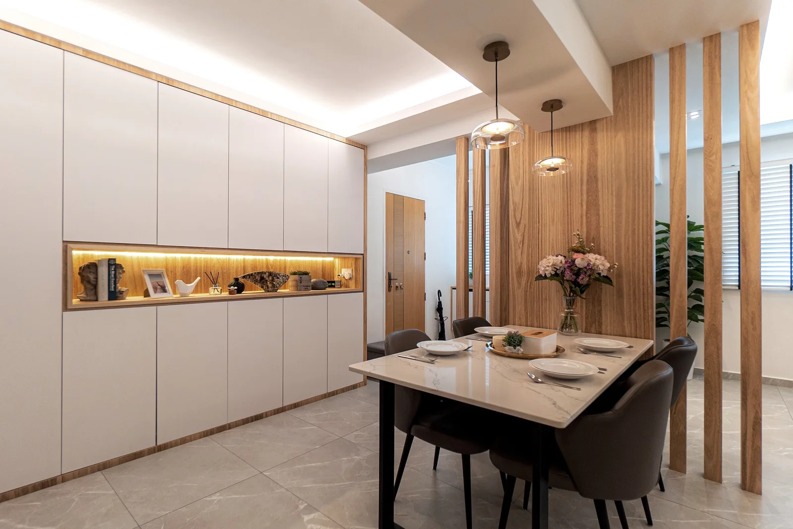
The dining room — the backlit display niche glows warm against the white cabinetry, the glass pendants descend precisely beneath the structural beam, and the timber slat screen opens a sightline back toward the entrance foyer.
Within the dining wall, J Concept carved out a display niche — a horizontal recess set mid-height in the white cabinetry, its interior in rich wood veneer and lit from below by a warm integrated lighting. It is the detail that gives the white wall its character. Without it, the cabinetry would be pure function. With it, the wall becomes a composition: something to look at, to style, to return to. The backlit veneer inside the niche glows like a window into the wood grain, reinforcing the warmth of the veneer feature wall opposite without repeating it.
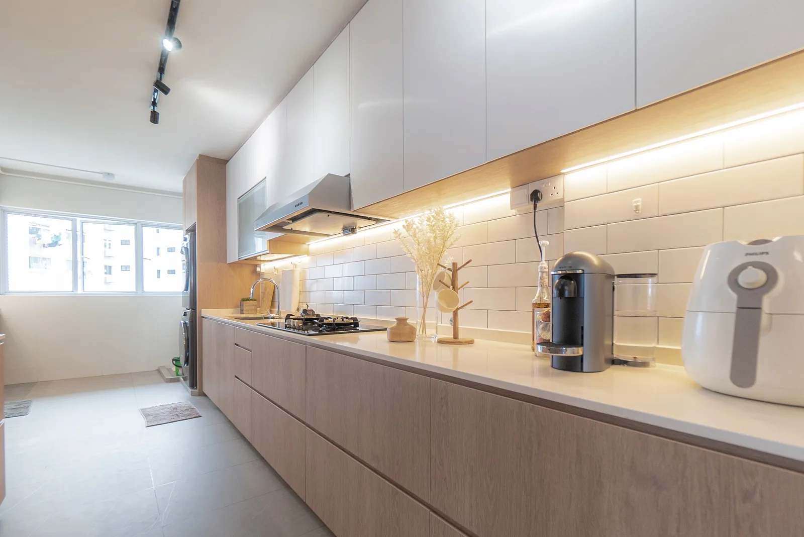
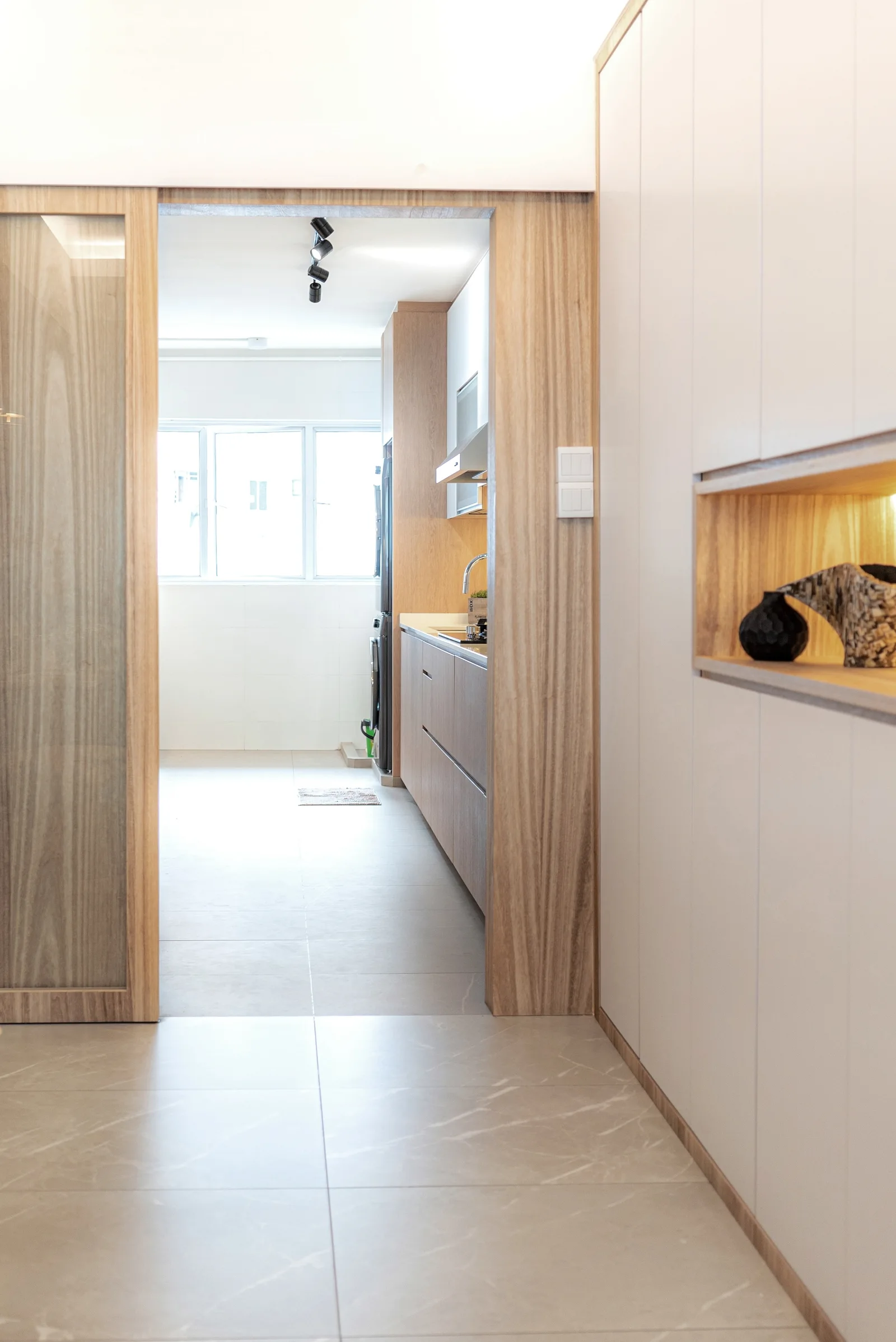
Left: The kitchen — classic white subway tile splashback, warm integrated lightings under the upper cabinets, and the veneer lower cabinetry that ties the kitchen palette back to the living spaces. Right: The kitchen glass door set flush within the veneer feature wall — one of four concealed entries that dissolve into the continuous panelling.
The kitchen itself is the one space in the home that deliberately introduces texture through material rather than form. White subway tiles on the splashback bring the tactile quality of a classic surface into a room otherwise defined by the smooth planes of the cabinetry. Their grid pattern adds rhythm without pattern, texture without weight. Under the upper white cabinets, warm integrated lightings light the counter below, reinforcing the same amber warmth that appears in the display niche and the entrance — a continuous thread of light that connects the home’s public zones at night.
The lower cabinetry in the kitchen shares the same veneer tone as the feature wall and the TV wall, ensuring that even behind the glass kitchen door, the kitchen reads as part of the same considered whole. The glass door itself is one of the feature wall’s four integrated entries — framed in veneer, it preserves a partial visual connection with the kitchen beyond while remaining part of the continuous panelling.
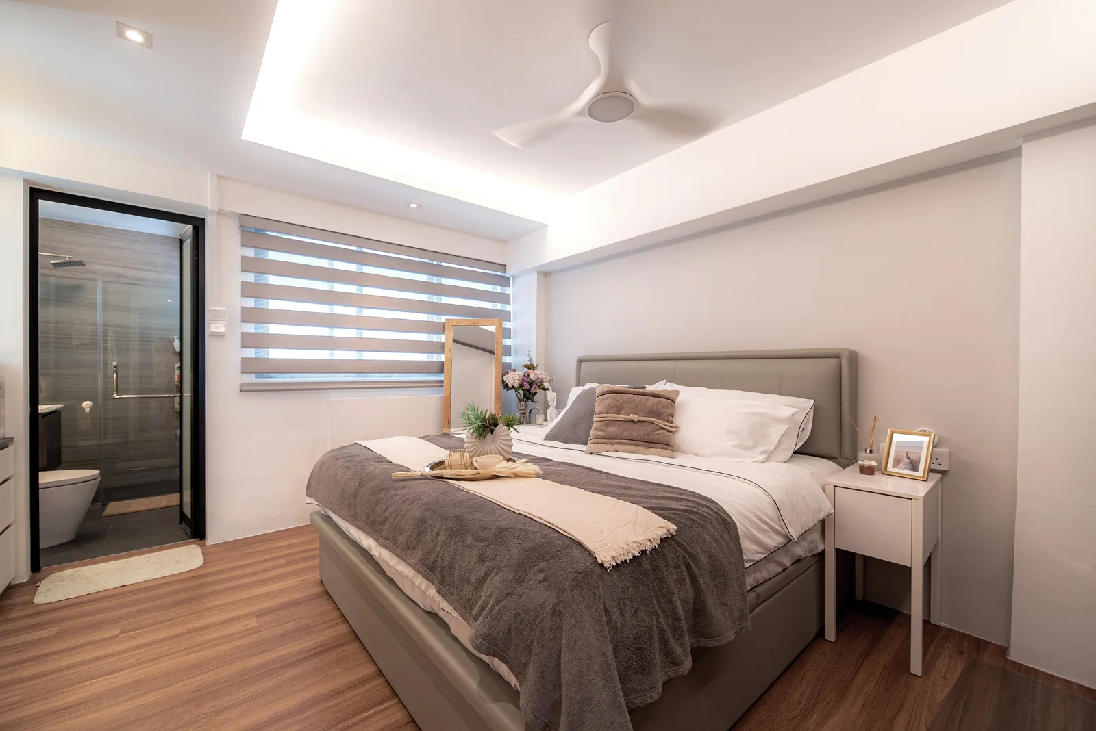
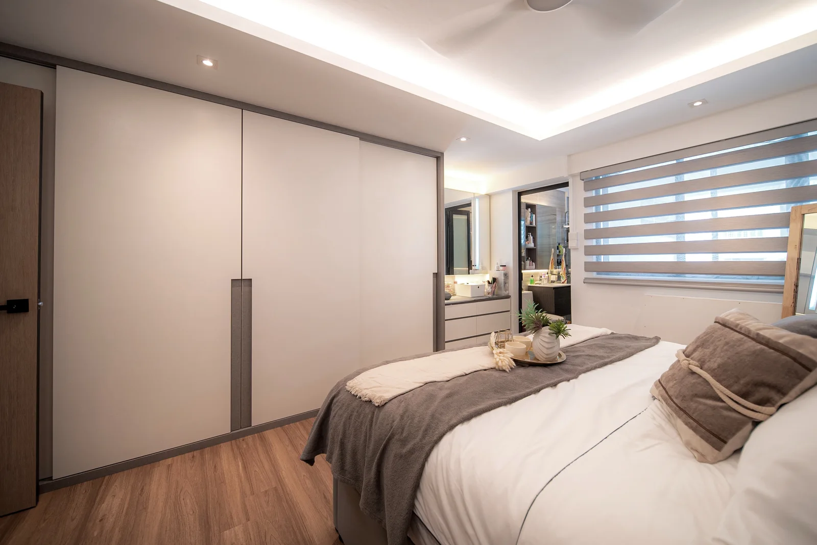
The master bedroom — a soft layered palette of grey, taupe and white, with floor-to-ceiling sliding wardrobes in muted tones, a dressing nook, and an ensuite accessed through a black-framed glass door.
The master bedroom steps away from the warm veneer palette of the shared spaces and into something cooler and quieter. Tones of grey, taupe, and white layer across the bedding, the wardrobe, and the walls in a palette that belongs to rest rather than living. Full-height sliding wardrobes in a muted off-white occupy the facing wall; their profile is low-key and deliberate, making storage disappear rather than asserting it. The ensuite beyond is accessed through a black-framed glass door that introduces a graphic edge to the otherwise soft room.
The adjoining study nook is integrated into the bedroom cabinetry, with a floating desk, open display shelving and concealed storage above, creating a practical workspace without visually overwhelming the room.
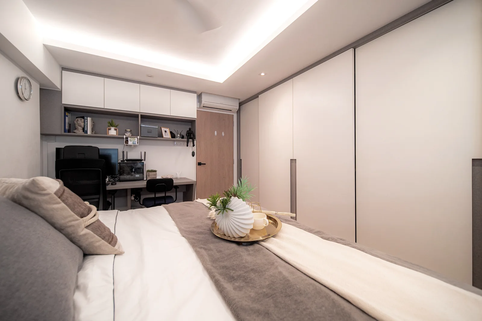
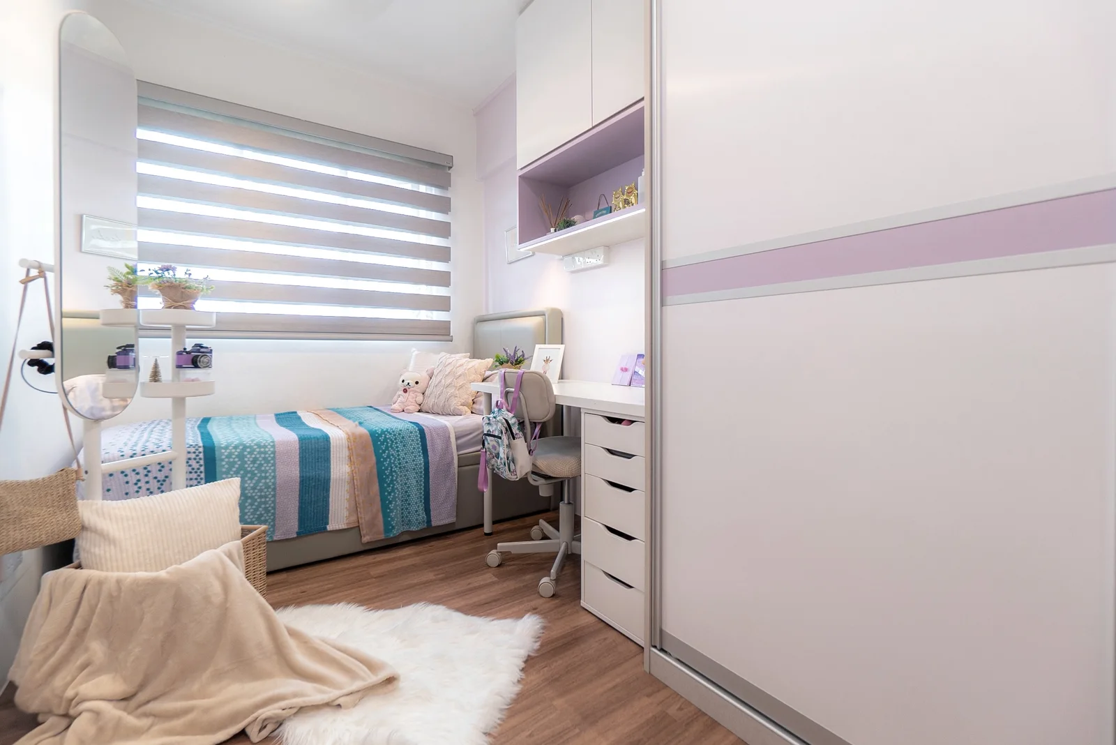
Left: The study nook within the master bedroom — floating desk, open display shelf with curated objects, and upper cabinetry for concealed storage. Right: The girl’s bedroom — a lavender accent stripe on the wardrobe and display niche, a practical desk and drawers, and a full-length mirror that opens the room visually.
The three children’s rooms were planned to give each family member a comfortable personal space. The girl’s room takes its personality from a single restrained gesture: a band of lavender on the wardrobe and the display shelf niche above the desk, precise enough to be expressive and quiet enough to remain elegant. Against the white of the rest of the room, the colour reads as a personal signature rather than a childish accent — a room that will grow with its occupant rather than against her.
The Bishan project is a demonstration that the HDB flat — Singapore’s most democratic and most constrained residential typology — is not a lesser canvas for good interior design. It is a different one, and J Concept Designers approaches it with the same rigour they bring to larger or more permissive spaces.
The constraints here were real: structural beams that could not be moved, wiring that could not go into walls, a lift that determined how materials could arrive, renovation schedules that had to respect neighbours and management regulations alike. Some large carpentry pieces and stone elements had to be carried manually up the staircase. None of this is visible in the finished home. What is visible is a family of five with a space that accommodates all of them — the parents with their bedroom and study, the children with rooms calibrated to their individual personalities, and everyone together in an open living and dining zone that is genuinely pleasurable to be in.
That is, in the end, what good residential design is supposed to do. Not to impress visitors, though this home does. But to make ordinary days feel calmer, easier and more enjoyable because the home has been thoughtfully shaped around the people who live there. At Bishan, J Concept Designers has proven, once again, that size is not a limit. Because when every square metre is considered, size stops being the measure of luxury.