
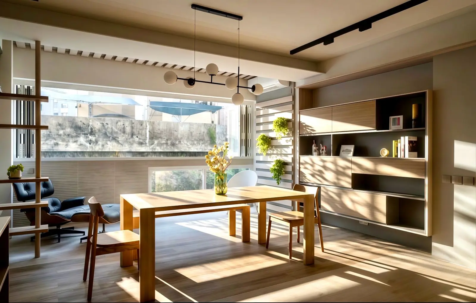
The apartment arrived with two powerful givens: the authentic square teak flooring of its 1970s origins and the humid mountain landscape beyond its windows. Andy Tong Design Consultants chose to preserve the first while opening the home more fully to the second.
The original plan was conservative and cellular. The kitchen stood apart from the social spaces, daylight struggled to travel through the interior and natural air movement was limited. The homeowner's brief was straightforward: make the kitchen larger and connect it with the living and dining areas. Andy saw an opportunity to go further. Rather than update the finishes around those constraints, the design team rewrote the apartment's internal logic.
An Entrance Reoriented Towards Connection
The intervention begins with a reversal: the former living and dining zones were completely swapped. The idea went beyond the homeowner's original request and prompted lengthy conversations about the advantages and trade-offs of the new plan. Andy worked through those questions with the client until they were comfortable with the shift. It unlocked a clearer route from the entrance towards the expanded kitchen, dining area and windows beyond.
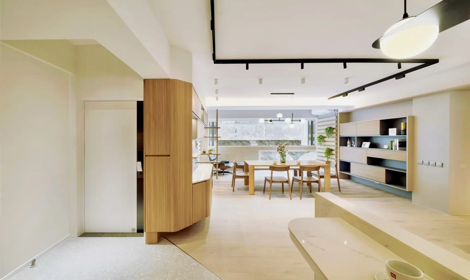
The new arrival sequence reveals the social spaces in layers, replacing the old room-by-room progression with a connected view through the home.
The Room Swap That Changed Everything
With the dining room moved into the brightest part of the plan, the original square teak floor becomes an organising surface. Rather than strip away this distinctly 1970s feature, the team kept its warmth and set it against lighter contemporary finishes. Oak-toned joinery, grey shelving and black track lighting bring definition to the room without erasing its mid-century character.
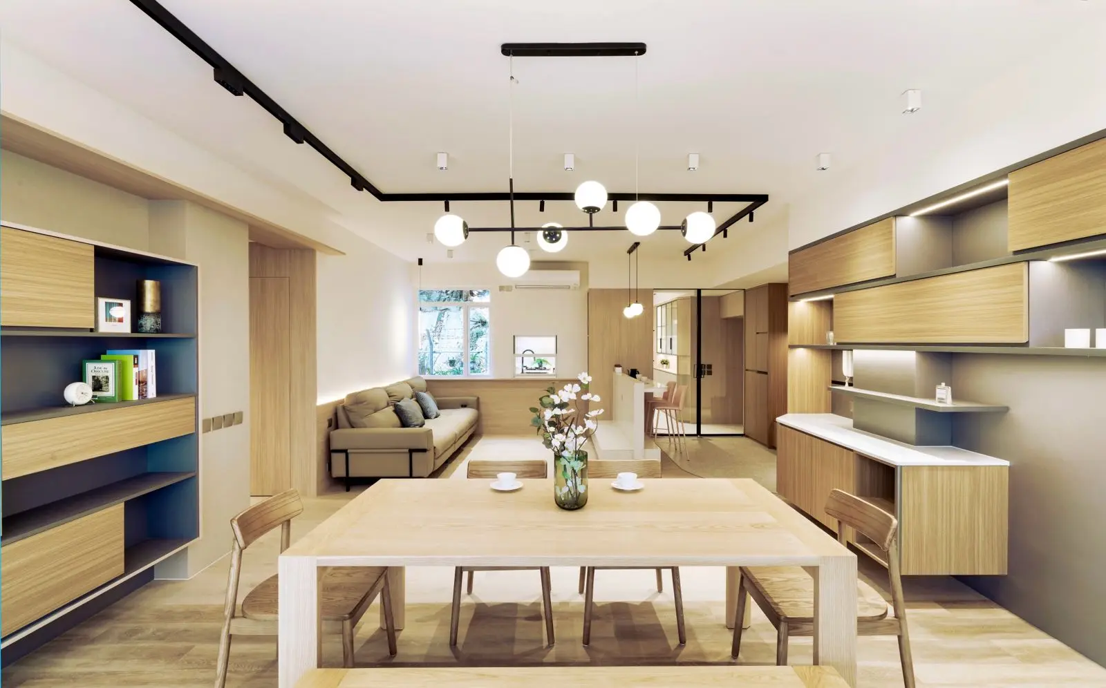
The relocated dining room now occupies the home's broadest, brightest axis, allowing the preserved teak floor and mountain-facing windows to set the atmosphere.
The arrangement is deliberately social. A long table holds the centre of the room, while storage is drawn to the perimeter and kept low or visually porous. The result is not simply a larger-looking interior; it is a space in which movement and conversation can continue without walls interrupting either.
One Element, Two Rooms
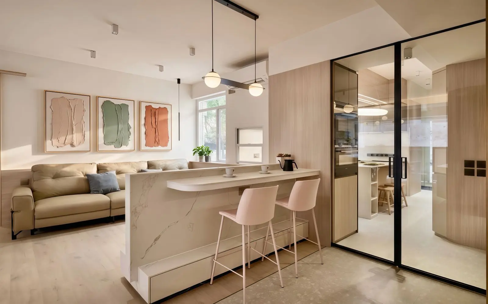
At the kitchen entrance, a bespoke coffee bar performs the most important act of mediation. Facing the kitchen and dining area, it becomes a place for preparation and informal gathering. On its reverse, the same volume resolves the living room's television wall and cabinetry.
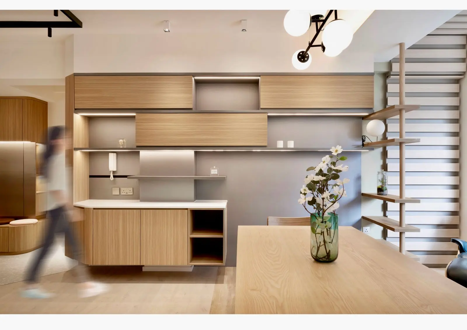
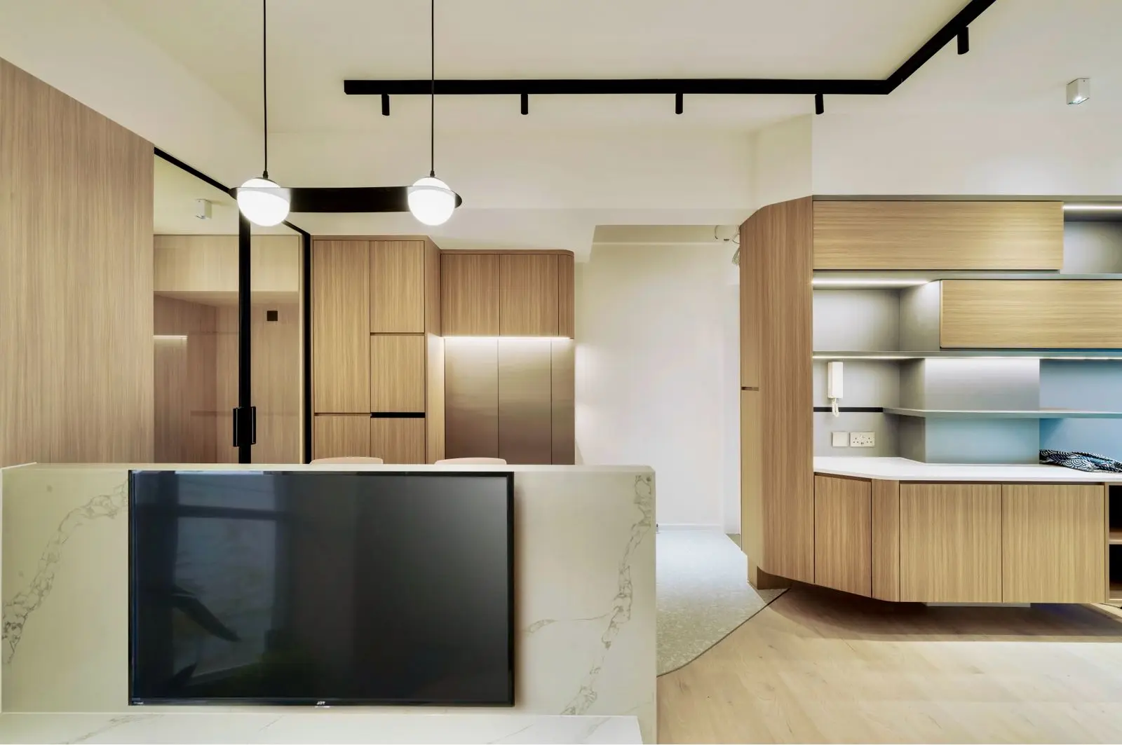
The dual-sided coffee bar zones the plan through use rather than enclosure—hospitality on one side, media and storage on the other.
The coffee bar answered the question raised during the client discussions: how could the kitchen become part of family life without losing storage or a sense of where one room ends and another begins? Its two working faces provide practical boundaries without conventional partitions. For Andy, the point is as much about relationships as floor planning: an object that serves two rooms can invite people to move and interact between them.
Opening the Apartment to the Mountain
The environmental strategy is as important as the plan. Expansive folding windows replace rigid boundaries, framing the balcony outlook and drawing mountain breezes through the apartment. Cross-ventilation helps moderate the humid conditions while daylight reaches further into the once-dim interior.
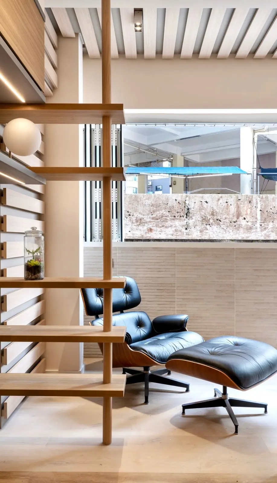
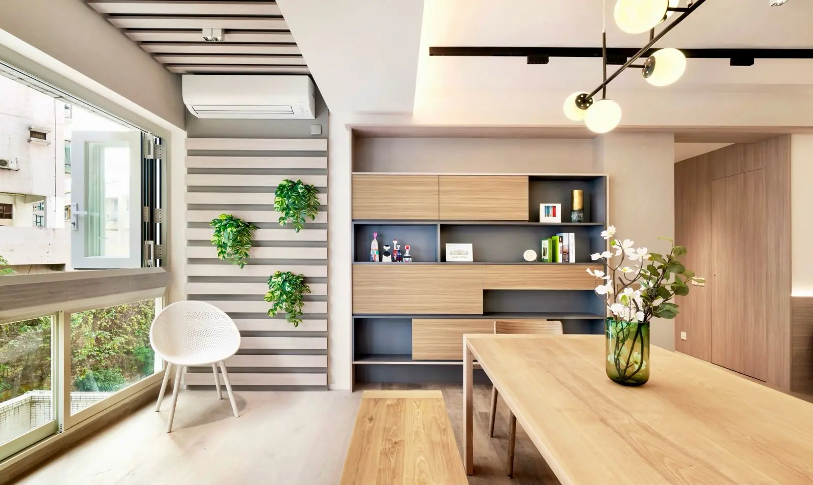
Wide folding windows turn the mountain edge into passive infrastructure, bringing daylight and cross-breezes into the social core.
Andy describes this as passive environmental control. Opening up the plan and installing wide folding windows were intended to improve the home's indoor air quality, moderate humidity naturally and reduce reliance on artificial lighting and air conditioning. The changes address the discomforts of an older apartment through the layout itself, without making technology the centre of the story.
A Working Room Reconnected
The expanded kitchen continues the restrained dialogue between vintage warmth and contemporary precision. Pale cabinetry, stone surfaces and dark-framed glazing keep the room visually connected to the living spaces, while its U-shaped working layout remains efficient and clearly defined.

The kitchen gains the connection requested in the original brief without surrendering the concentrated layout required for everyday work.
Storage Drawn Into the Architecture
Beyond the social core, the private rooms adopt a denser, quieter register. In one bedroom, the bed, desk and library joinery are composed as a continuous working wall. In another view, full-height wardrobes and open shelving frame a clear route through the room, keeping storage extensive but visually ordered.
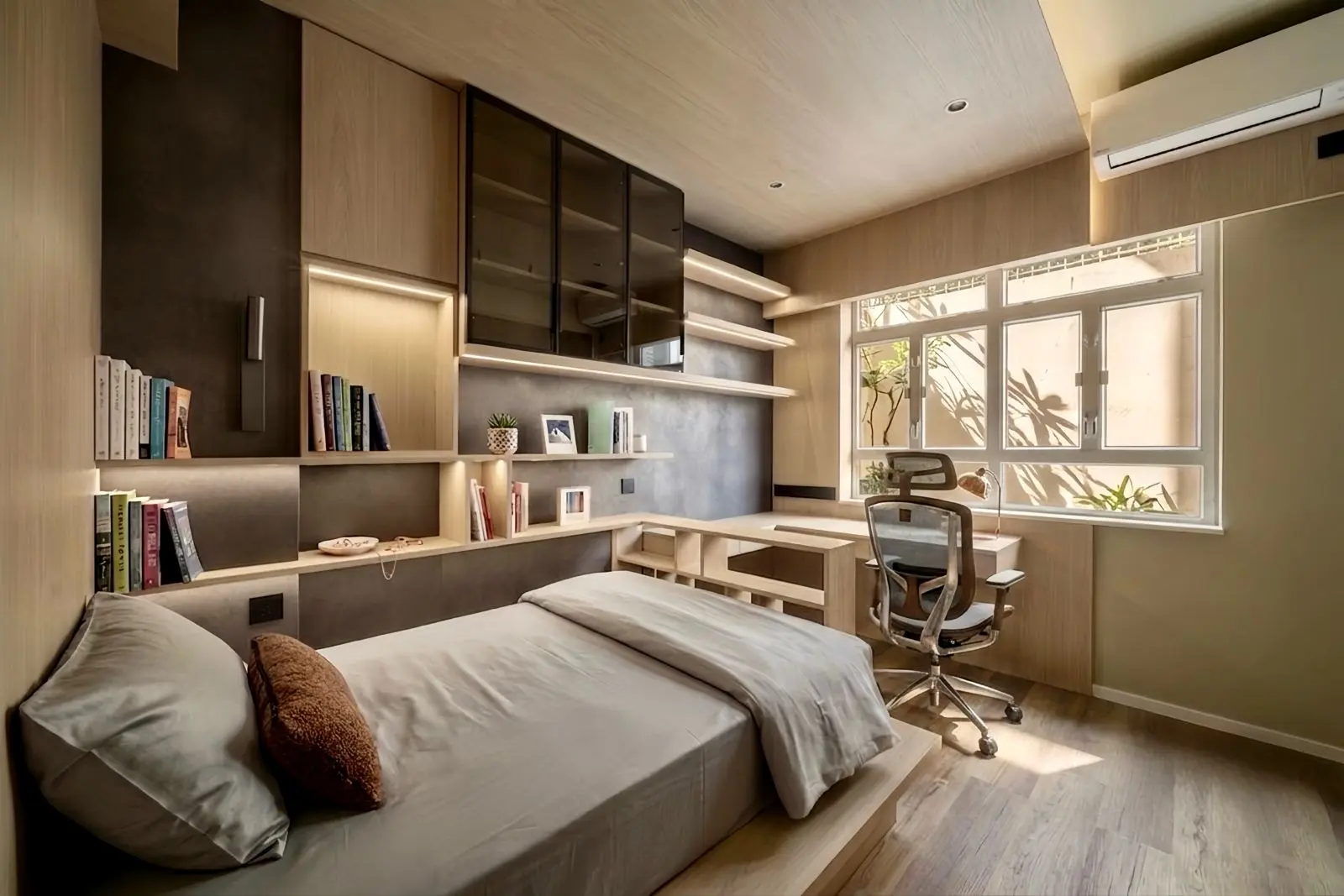
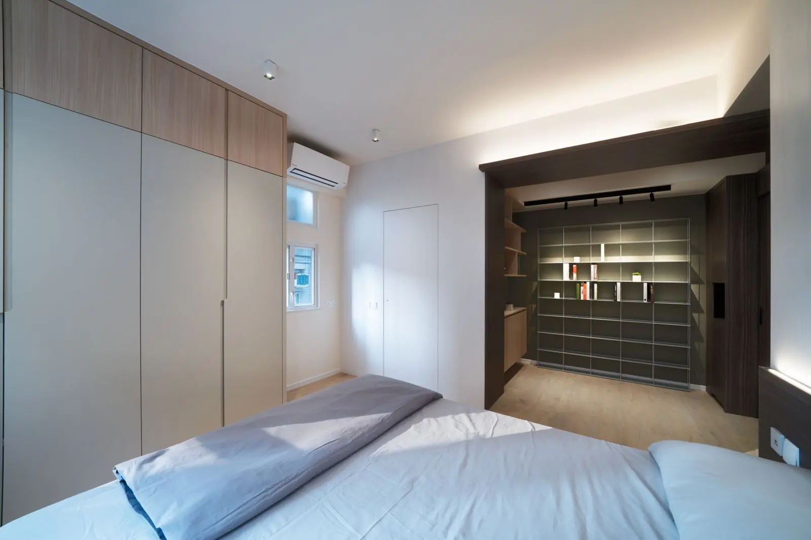
The private spaces exchange the social area's openness for a more enveloping architecture of rest, study and storage.
The bathroom closes the journey with stone, glass and warm timber. A broad mirror amplifies light across the vanity, while the glazed shower keeps the compact room visually continuous.
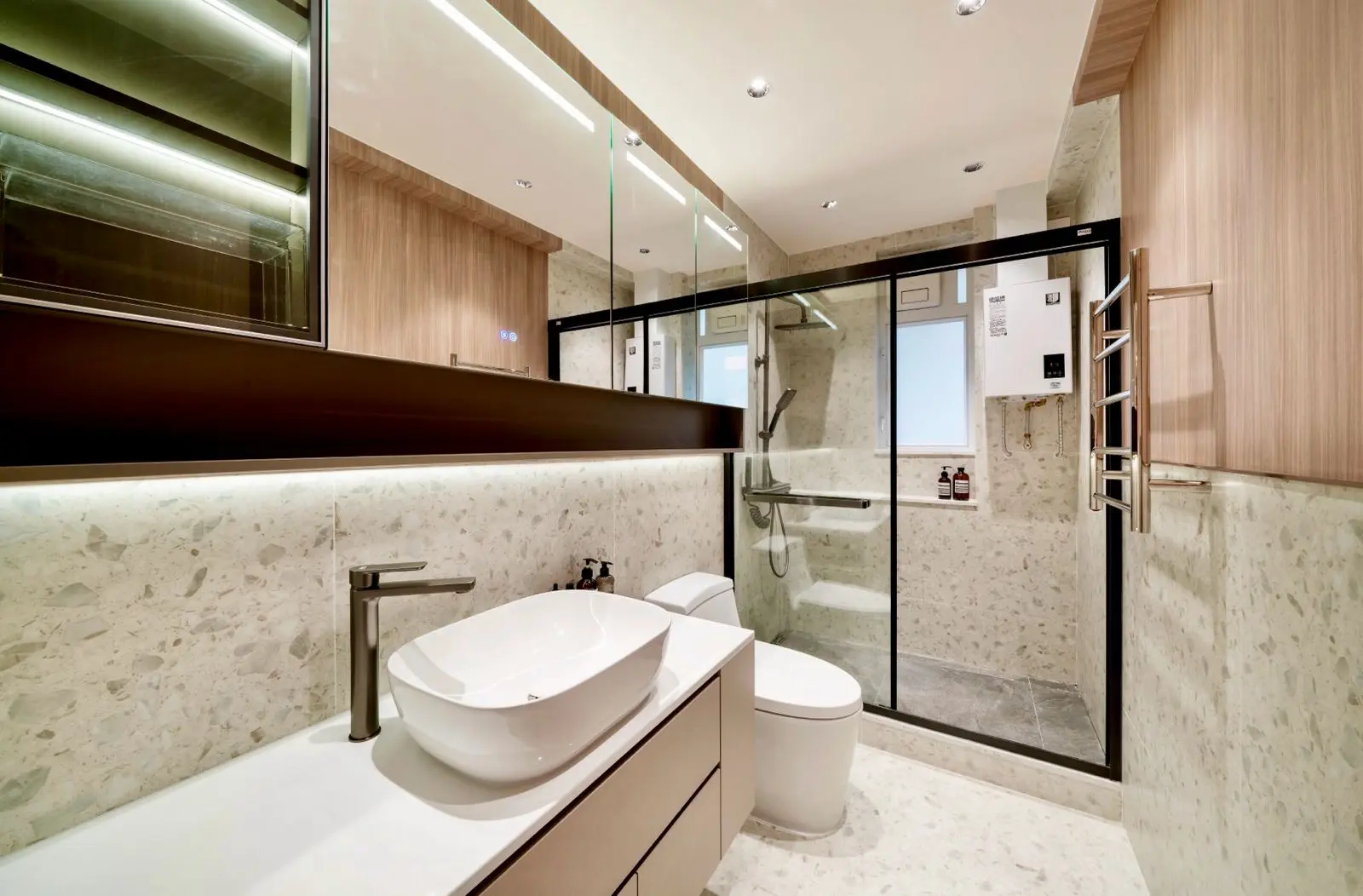
Stone surfaces and clear glazing bring the home's preference for continuity into its most private room.
From Spatial Change to Daily Habit
The project's ambition was ultimately behavioural. Andy says the family now shares a more interactive environment, one that encourages gathering and conversation along the new path from entrance to living, dining and kitchen. For him, the lesson extends beyond this apartment: sometimes a designer must carefully challenge the expected arrangement of rooms, and explain why, to give a client what their original brief was reaching for. The preserved floor carries the home's history; the reconfigured plan gives that history a different future.
A single spatial decision can do more than change a floor plan. It can change how a household meets.